

Making an engineering knowledge platform easy to navigate


Role
UX/UI Product Designer
Users
AEC engineers
Tools
Figma, Loom, Teams
Result
+22% tasks, −20% QA cycle time
I redesigned Pinnacle Series’ core navigation and workflow architecture for architecture, construction and engineering professionals.
Task completion went up 22%, and QA cycles got 20% shorter.
1. CONTEXT
Moving assignments into the new Peak Experience
Pinnacle Series is the flagship enterprise learning knowledge management platform for AEC firms across technical and non-technical audiences. Clients were moving from the legacy management utility to the new Peak Experience.
What was wrong
Clients needed to assign, edit and auto-enroll learning across
- multiple types of learning content.
- users with varying levels of access.
2. WHO USES IT
Three roles, three levels of access
Administrators
Assigns and manages learning for anyone on the platform, sees every assignment and runs learning reports.
Assignors
A manager or group owner. Assigns, manages and sends reminders only to their direct reports or members of the groups (and child groups) they own.
Learners
An AEC professional who receives assignments with due dates, and is marked complete once they finish the content (85% of a video watched).
3. RESEARCH
What testing with real users showed
Methods
- User testing
- Interviews
- Analytics
Key findings
- Users couldn’t find learning assignment details easily.
- Creating a new learning assignment took too many steps.
- It was difficult to edit or re-assign assignments.
4. INFORMATION ARCHITECTURE
Rebuilding navigation around the tasks people actually do
Dedicated Assignments item
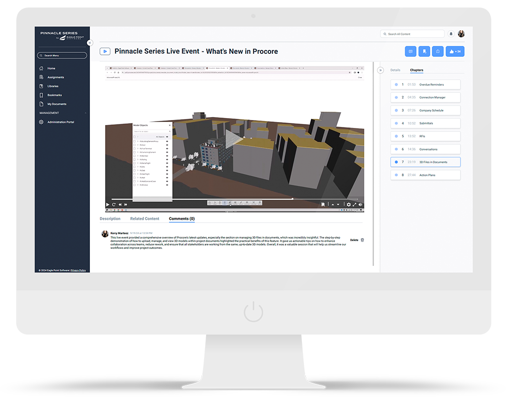
A new item in the left menu, shown only to people who can assign learning, keeps the menu simple for everyone else.

One hub, branching entry points
Auto-enrollments open from the Assignments landing page. New Assignment branches into Content or Assessment only for clients with KnowledgeSmart configured.

Scoped for migration
Reporting, due dates per user and mixed content-plus-assessment auto-enrollments were left to later phases so migration could ship first.
5. WORKFLOW REDESIGN
Making an assignment in one guided flow
- New Assignment: content or assessment
- Select content: 5 types, preview
- Select users: add users individually, by group, or upload a spreadsheet
- Options: due date, exclude completers, assignors
- Success: Assigned, and assignors notified


6. PROTOTYPES & TESTING
Iterating in Figma until the flow tested clean


7. PATTERNS, ACCESSIBILITY & HANDOFF
Patterns that scale across modules and are clear for developers
Intuitive actions
- Edit, Email, Remove, Re-Enroll and Export turn on depending on the type and status of the selected assignments.
- The content and user pickers were reused from existing modules.
Developer handoff
- Evolved an existing design system with scalable patterns aligned with accessibility best practices.
- Annotated specs and prototypes that cut ambiguity, so QA cycles got 20% shorter.

Filter table results 
Add assign training modal 
Table of current assignment 
Add email modal 
Accordion of options 
Edit modal for auto-assignments 
Bulk modify existing assignment 
Accordion of assigned content
8. OUTCOME
What changed for users and the team
+22%
Task completion, with less time for new users to get up to speed.
−20%
QA cycle time, thanks to clearer prototypes and specs.